Tutor food
The Coroners Court – Comparative Projects – Music
The Coroners Court is relatively unique in it’s approach to composition and music as a whole, but different aspects of the whole can be linked to other projects that we have either been inspired by, or are just creating work along similar lines.
From a strictly musical sense, the court clearly reflects a lot of classic progressive rock, with its fusion of jazz funk and rock along and sprawling long structures, from the obvious influence of King Crimson, through the joining of rock and jazz in The Soft Machine, to the ubiquitous Pink Floyd and ELP. While these bands are sonically very related to The Coroners Court, they cannot be considered competition, per se. While all of them except for The Soft Machine are still sporadically performing, in some sense, they are really running on remaining momentum from when they were more popular, relying mostly on an older audience – the audience they have kept with them.
There is, however a small uprising in nu-prog, with bands such as Pure Reason Revolution (admittedly very recently disbanded), who hoped to revive the spirit of Pink Floyd and market it at a new, younger generation with electronica and post-rock elements added into the mix. They achieved relative success to this aim, before deciding their journey had run its course, just before christmas. Other bands in the mainstream can be considered as nu-prog, or at the very least rock with certain prog elements, for example Radiohead, Muse, Coheed and Cambria, Battles, Indukti (ok, maybe not quite so mainstream, but still fairly popular!)
Outline of the Coroners Court as a PDAR project
The Coroners court as a whole is too great a project for any one of us to take on as a Project Development and Applied Research project, so initially, we split the project between members, with different people dealing with the audio, visuals, concepts, marketing and technology.
I chose to take on a combination of the aesthetic design and conceptual design as the part of the project I would develop, being particularly interested in background narrative in performance and the media surrounding it. Unfortunately, people went off on tangents a lot, and by the end it was only me and Gary working on the Court for our projects.
As Gary was working on the marketing and networking aspects of the Court, we dicided we would both present – as a practical outcome of the unit – a working prototype website for the Coroners Court. For my part, this would give a solid product with which I could demonstrate the graphical and some of the conceptual design for the court, the textual/media content would be dealt with by Gary, past anything that would demonstrate conceptual design.
We started by discussing the conceptual backstory as a band, then I developed the ideas put forward into a slightly more fleshed out story – The Coroner’s Court being a court within a system of bureaucratic gods. Our court deals with the fate of individual humans, and each ‘track’ of our performance, is our method of deciding and controlling that persons life. Our ability to shift between tracks repeatedly within a set represents the intertwining of the lives we control.
Each god represents a different aspect of ‘fate’ – Control/chaos. Sanity/Insanity. Happiness/Sadness. Love/Hate. Decadence/Frugality.
While the Court already had a strong visual image, I wanted the input of a designer to help cement that image into a clear production. Initially I talked to a variety of different graphic designers, from meeting with the Newport Uni Design Society, and discussing setting them a brief for a mini project, to talking to other graphic design and art students. I settled on Livy – an animation student, soon to be switching over to animation, as her style matched the graphic-novel-esque style that I was hoping for.
After a couple of meetings with Livy to discuss ideas, the Court got together for a practice, and he had a quick photo shoot to give her some images to work from. Unfortunately not everyone was in costume, and Gary was missing for the shoot, but time restraints and waiting on a photo shoot from fashion photography that never happened meant that that 1 shoot was all we had to work with.
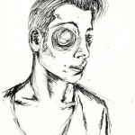
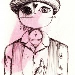
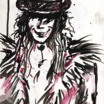
Livy initially made several quick sketches in different styles, with both ink and paint, and sent them to me; I decided that the simpler, sketchier purely-ink graphics best matched the band’s style – the simple black and white aspect of our floor symbol mirrored in the drawings, and the sketchy aspect referencing our improvised nature as a band. I then asked her to redraw each character in this style, once for each half of their character. I then digitally edited the images to fit the site and make the background transparent.
I continued this ‘sketched’ visual design with the general design of the website.
Initially, the site was quite expansive, but we eventually cut it back to 3 pages, the home encompassing the majority of information, to match with web 2.0 conventions. This meant that we could no longer use the character related to each page for the background image for that page, so I settled on using a random background on each load of a page, with a slight weighting towards my character (as ‘control’ and ‘chaos’, both the random element and the attempt to get myself to show more often matched my character). The random element also alludes to our changing structures in our live performances.


